Blog Archive
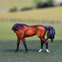
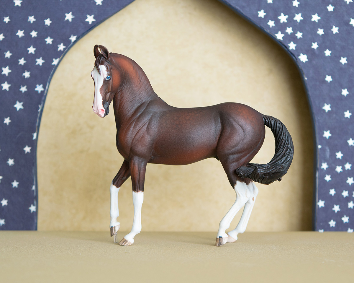
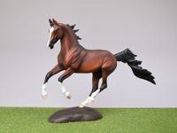
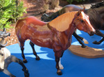
Reveler
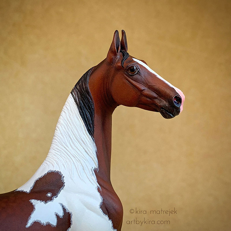
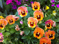
Sarah Rose's mini ASB resin, painted by me to a flashy bay tobiano.read more
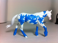
NaMoPaiMo
I'm entering "National Model Painting Month" to paint these models during February.read more
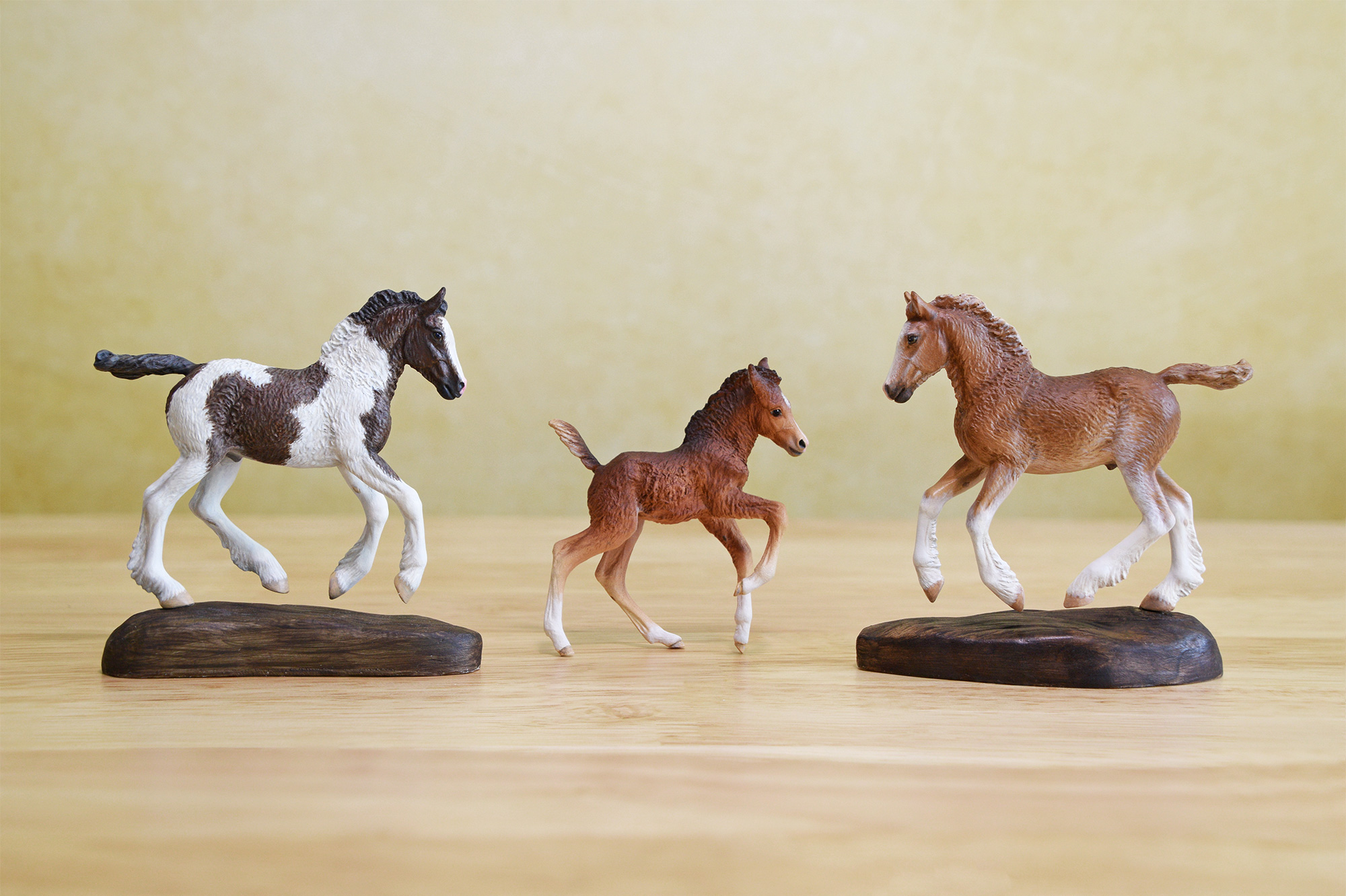
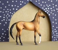
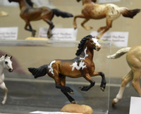
BreyerFest 2016
I'm back from another trip to BreyerFest. Here are the mini resins I had for sale at the Artisan's Gallery!read more
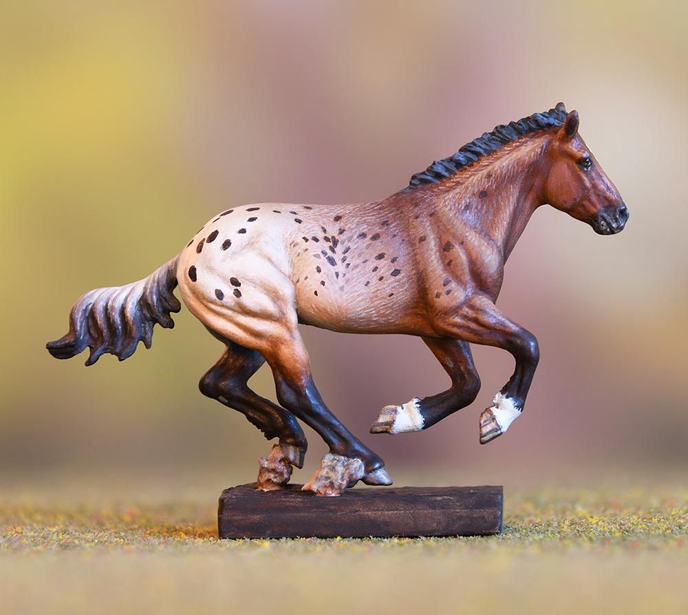
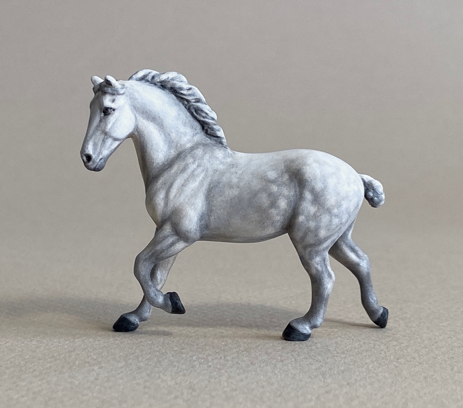
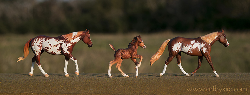
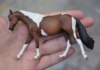
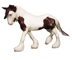
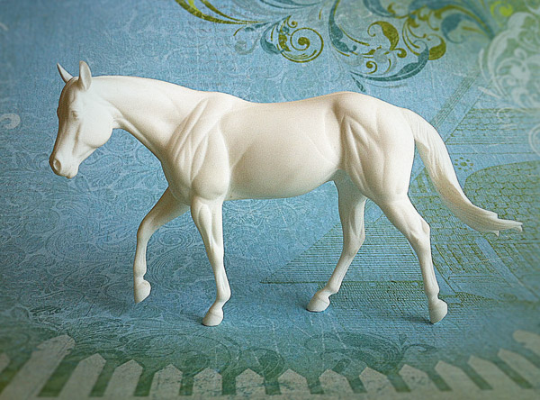
Moxie #1
I've finally finished painting this mini "Moxie" stock mare by Sarah Rose. She turned out beautiful!read more
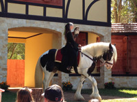
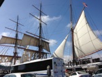
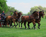
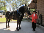
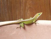
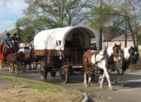
Renfest
Had a fun time at the Texas Renfest a few weeks back. Here are a couple of pix from the faire!read more
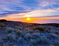
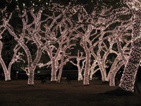
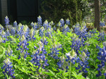
Hill Country Lights
I visited Austin last weekend, and a friend and I drove out to the hill country to look at Christmas lights. Here are some pix from the incredible lights display in Johnson City, TX.read more
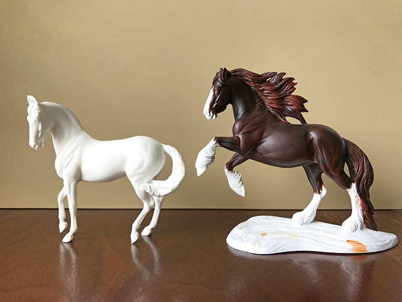
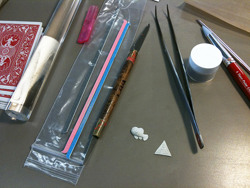
PMC
I took a class in using Precious Metal Clay (PMC). Love it!read more
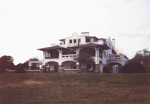
Casa Mare
Here's an old photo of the "Big House", the old William Scott mansion that used to stand on the grounds of camp Casa Mare in Seabrook, TX.read more
Back to Top